
































Kitchen Tile Grout Colors: How To Match Or Contrast Your Tile

Choosing the right grout color is one of the most important finishing decisions in a kitchen renovation. While cabinets, countertops, and tile usually receive most of the attention, the color between individual tiles can have a surprisingly significant impact on the finished design. The right shade can create a seamless appearance, emphasize a decorative pattern, or introduce contrast that makes an otherwise simple backsplash stand out.
Whether you're installing glass mosaics, porcelain tile, or a decorative backsplash, understanding how grout colors interact with different materials can help you achieve a more polished result.
Starlike Pro 03 Gesso Epoxy Grout

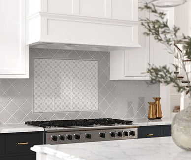
Starlike Pro 03 Gesso by Litokol is an excellent option for homeowners seeking a light, understated finish that complements a wide variety of kitchen tile designs. Gesso is a light neutral gray, making it particularly useful when you want something softer than a traditional bright white without introducing a noticeably dark joint.
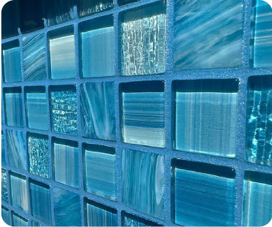
Its versatility makes it especially appealing for white porcelain, light gray ceramics, glass mosaics, and contemporary backsplash designs. A closely coordinated shade can help create a continuous appearance, allowing decorative tile patterns and surface textures to remain the primary focus.
Beyond its color, this product offers the performance advantages of a two-component epoxy formulation. Starlike Pro is designed for grout joints ranging from 1mm to 20mm and is compatible with porcelain, ceramic, glass mosaics, large-format slabs, marble, granite, and natural stone.
AquaBlu highlights its waterproof, stain-resistant, UV-stable, and non-porous characteristics. The formulation also incorporates Defender antimicrobial protection and Litokol's Zherorisk oxirane-free technology. Its dual-purpose design can function as both an adhesive and grout, subject to the manufacturer's application requirements.
Each bucket contains 5.5 pounds of material. Homeowners looking to add a decorative touch can also choose optional Galaxy, Gold, or Spotlight shimmer additives.
For kitchens where a clean, coordinated appearance is the goal, Gesso offers a sophisticated neutral foundation with the added performance characteristics of a premium epoxy product.
Starlike Pro 26 Bianco di Spagna Epoxy Grout

For kitchens featuring warmer materials and natural-inspired finishes, Starlike Pro 26 Bianco di Spagna offers an attractive alternative to cooler white and gray grout shades. Its light beige, sand-inspired coloration creates a softer appearance that can complement cream porcelain, travertine-inspired surfaces, natural stone, and warm-toned decorative tile.
This shade is particularly appealing when bright white grout would create too much contrast with the surrounding materials. Instead, it provides a gentle transition between individual pieces while maintaining the clean, refined look many homeowners want in a finished kitchen.
Like the other Starlike Pro options, Bianco di Spagna uses a high-performance two-component epoxy formulation. It is designed for joints measuring 1mm to 20mm and can be used with porcelain, ceramic, glass mosaics, marble, granite, and natural stone.
Its non-porous surface helps resist the absorption of grease, dirt, and liquids, making it an interesting choice for kitchen environments where spills and everyday cooking messes are common. AquaBlu also highlights its stain resistance, waterproof characteristics, UV stability, and crack-resistant flexibility.
The product incorporates Defender antimicrobial protection and the Zherorisk oxirane-free formula. It is supplied in a 5.5-pound bucket and can be customized with optional Galaxy, Gold, or Spotlight shimmer additives.
Bianco di Spagna is particularly well suited to kitchens designed around warm neutrals, natural textures, and understated elegance. Its sandy coloration can help create a cohesive installation without making the joints disappear completely.
Nero Grafite EVO 140 Epoxy Grout

For homeowners who want their backsplash to make a stronger statement, Nero Grafite EVO 140 provides a dramatic alternative to traditional light-colored finishes. Its deep graphite appearance creates contrast against lighter tile and can emphasize geometric patterns, rectangular layouts, and decorative mosaics.
Dark grout is particularly effective with white, cream, and lighter gray tile. Rather than allowing individual pieces to blend together, it highlights their shapes and creates a structured appearance. It can also complement darker cabinetry, black appliances, charcoal countertops, and contemporary metal finishes.
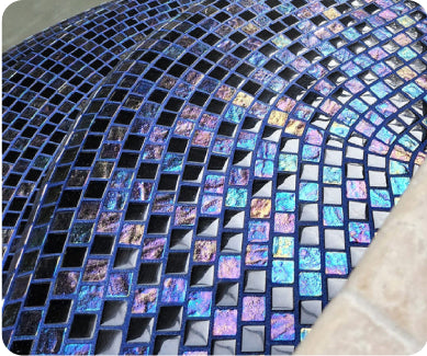
Manufactured by Litokol, Starlike EVO is a two-component epoxy formulation designed for demanding installations. AquaBlu specifically emphasizes its performance in swimming pools, spas, hot tubs, fountains, and water features, where resistance to moisture and chemicals is especially important.
Its listed benefits include resistance to water, chlorine, saltwater, pool chemicals, UV exposure, and staining. The product is also described as crack resistant, color stable, and easy to clean with water-based solutions.
Nero Grafite is supplied in a 5.5-pound bucket and can be purchased with optional Galaxy, Spotlight, or Gold shimmer additives. Its dual-purpose formulation is designed for use as both grout and adhesive, although the manufacturer's technical requirements should always determine suitability for a particular kitchen installation.
For homeowners seeking a bold, contemporary finish, this dark graphite shade offers a distinctive way to make grout an intentional part of the overall design.
Matching Versus Contrasting Grout
There are two popular approaches to selecting grout: matching the tile or creating contrast.
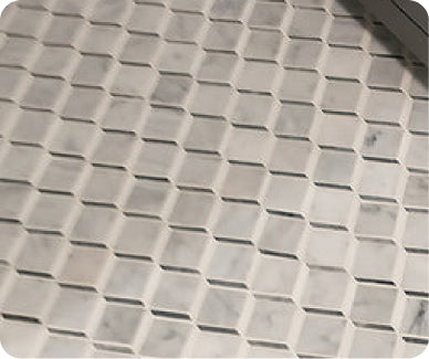
Matching grout produces a more continuous appearance. Choosing a shade close to the dominant tile color minimizes the visibility of individual joints and allows the surface to feel more uniform. This is particularly attractive for minimalist kitchens, light-colored backsplashes, and installations with intricate patterns.
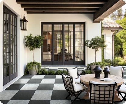
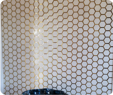
Contrasting grout takes a more decorative approach. A darker shade against white tile, for example, emphasizes the shape and arrangement of every piece. This can be especially effective with subway tile, hexagons, and geometric mosaics.
Neither approach is necessarily better. The decision depends on whether you want the tile itself or its overall pattern to become the primary design feature.
How To Choose The Right Shade
Consider the other finishes in your kitchen before making a final selection. Cabinetry, countertops, flooring, hardware, and lighting can all influence how a grout shade looks once installed.
Warm white and beige tones generally complement cream cabinetry, natural wood, and warmer stone finishes. Cool grays work particularly well with contemporary kitchens featuring stainless steel, white countertops, and gray cabinetry.
Darker shades introduce definition and can coordinate beautifully with black fixtures, charcoal countertops, and modern appliances.
Lighting is another important consideration. Natural daylight, warm pendant fixtures, and under-cabinet lighting can make the same shade appear noticeably different. Testing a sample alongside your actual tile is one of the best ways to avoid surprises.
Practical Considerations Before Installation
Color is important, but performance and compatibility should always come first. Consider the tile material, joint width, countertop proximity, and expected exposure to moisture, grease, and cleaning products.
Epoxy grout can be particularly useful in kitchens because of its resistance to staining and liquid absorption. However, its installation requirements differ from traditional cement-based products. Proper mixing, application, working time, and cleanup are essential for a successful result.
Remember that grout is not a substitute for an appropriate waterproofing system. Follow the tile manufacturer's and grout manufacturer's recommendations for the complete installation.
FAQ
Should grout match or contrast with kitchen tile?
Matching creates a seamless appearance, while contrasting emphasizes individual shapes and patterns. The best choice depends on your preferred design.
Is epoxy grout good for kitchen backsplashes?
Yes. Epoxy grout offers resistance to stains, moisture, and grease, making it a useful option for kitchen applications when compatible with the selected tile.
Does white grout turn yellow?
Discoloration can occur with certain grout formulations and cleaning conditions. Choosing an appropriate high-performance product and following maintenance recommendations can help preserve its appearance.
What grout color works best with white tile?
White and light gray create subtle transitions, while charcoal and graphite produce a more pronounced geometric contrast.
Should I test grout colors before installation?
Absolutely. Testing samples alongside your actual tile, cabinetry, countertops, and lighting helps you understand how the finished combination will look.
