


























































Gray Backsplash Tile for Kitchens: Timeless Ideas for a Modern, Elegant Space


A kitchen backsplash does more than protect walls from spills and heat. It plays a major role in defining the personality of the entire space. Among all color choices available, gray has remained one of the most enduring options for homeowners and designers alike. Its strength lies in its adaptability. It can feel warm or cool, bold or subtle, modern or traditional depending on tone, texture, and surrounding materials.
What makes this color especially appealing is its ability to sit quietly in the background while still adding depth and structure. It does not compete with cabinetry, countertops, or appliances. Instead, it ties everything together, acting as a visual bridge between elements that might otherwise feel disconnected.
This guide explores how gray backsplash designs can transform a kitchen into a space that feels intentional, balanced, and timeless.
Capri Blue Valentino 12 X 24 Stone Tile

The Capri Blue Valentino 12 x 24 Stone Tile brings a natural, elevated presence to kitchen environments. While it incorporates gray undertones, it also introduces subtle movement through its stone inspired surface variation. This gives the material a layered appearance that feels organic rather than flat.
The larger format is especially effective in contemporary kitchens. Fewer grout lines create a clean, continuous surface that enhances the feeling of spaciousness. This makes it a strong option for open concept layouts where visual flow is important.
Its stone composition adds depth and authenticity, offering a tactile quality that mimics natural material while maintaining durability. This balance makes it suitable for both high traffic cooking areas and decorative backsplash applications.
The tonal variation within the surface allows it to adapt to different lighting conditions. In natural light, it can appear soft and airy. Under warmer lighting, it becomes richer and more grounded, helping create a welcoming kitchen atmosphere.
It pairs well with both light and dark cabinetry. Against white cabinets, it introduces gentle contrast. Against darker finishes, it adds dimension without overwhelming the space. This versatility makes it a strong foundation piece for a wide range of kitchen styles.
Metro Shadow Grey 3 X 6 Porcelain Tile

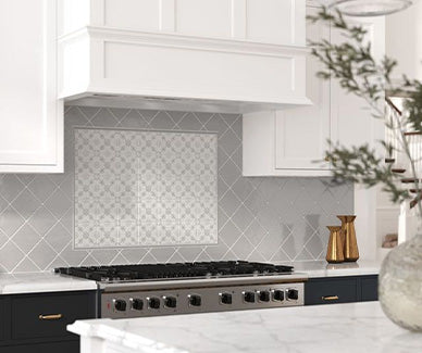
The Metro Shadow Grey 3 x 6 Porcelain Tile is a classic format that brings structure and familiarity to kitchen design. Its rectangular shape allows for traditional installation patterns that remain popular for their clean and organized appearance.
This tile is particularly effective for creating rhythm across a backsplash surface. The repeating format establishes a sense of order, which helps visually anchor the kitchen design. Depending on layout direction, it can either elongate walls or emphasize vertical space.
The porcelain material adds durability and ease of maintenance, making it practical for everyday cooking environments. It resists moisture and staining, which is especially important in areas behind stoves and sinks.
The shadow grey tone sits comfortably in the middle of the neutral spectrum. It is not overly dark or light, which allows it to adapt easily to surrounding materials. This makes it a flexible choice for both renovation projects and new builds.
When paired with contrasting grout, the tile pattern becomes more defined and graphic. With matching grout, it blends into a smoother, more continuous surface. This adaptability allows homeowners to control the visual intensity of the design.
Habitat 5 X 5 Ceramic Tile

The Habitat 5 x 5 Ceramic Tile introduces a slightly more handcrafted feel to kitchen backsplash design. Its square format provides symmetry, while subtle surface variation adds warmth and character.
This tile works particularly well in kitchens that aim for a softer, more lived in aesthetic. It does not feel overly polished or industrial. Instead, it introduces gentle imperfection that makes the space feel more inviting.
The ceramic material contributes to a slightly softer visual finish compared to porcelain or stone. This makes it especially suitable for homeowners who want a balance between structure and comfort.
Its mid scale size allows it to function in both modern and traditional kitchens. It can be installed in a straightforward grid for a classic appearance or offset slightly for a more relaxed layout.
The gray tone within this tile is subtle and versatile, allowing it to blend seamlessly with a wide range of cabinetry and countertop materials. It works especially well in kitchens that incorporate natural wood or soft neutral finishes.
Overall, this tile offers a balanced combination of structure and warmth, making it a dependable choice for creating a welcoming kitchen backdrop.
Why Neutral Tones Continue To Dominate Kitchen Design
Neutral palettes have become a foundation in kitchen design because they offer flexibility over time. Trends may shift toward bold colors or dramatic finishes, but neutral surfaces remain relevant because they adapt easily.
Gray sits in a unique position within this spectrum. It is more dynamic than white, yet more understated than black. This balance allows it to complement a wide range of materials including wood, marble, quartz, and stainless steel.
Another reason for its popularity is longevity. Kitchens are long term investments, and homeowners often prefer materials that will not feel outdated within a few years. Gray provides a safe yet stylish middle ground that can evolve with changing décor.
Lighting also plays a role in how these surfaces behave. In bright natural light, gray can feel airy and soft. Under warm artificial lighting, it can become cozy and grounded. This shifting quality adds subtle visual interest without requiring bold patterns or colors.
Popular Styles And Layouts For Kitchen Backsplashes
There are many ways to use gray tones in backsplash design, and the layout choice can dramatically influence the final look.
Subway-inspired rectangular patterns remain a classic option. Their structured repetition creates a clean and organized appearance that works well in both modern and traditional kitchens. Horizontal layouts tend to widen a space visually, while vertical stacking adds height.
Square formats offer a more balanced and symmetrical look. They often feel slightly more traditional, but depending on finish and grout color, they can also lean modern.
Larger format tiles reduce visual interruptions and create a more seamless surface. These are often used in contemporary kitchens where simplicity is key.
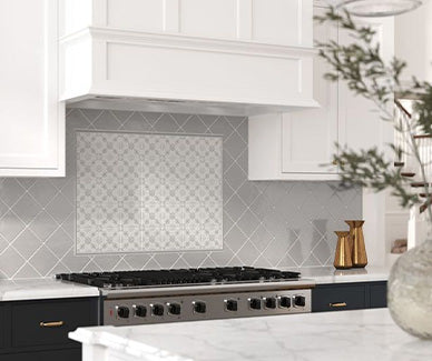
Textured or patterned tiles introduce depth without relying on bold color changes. These are ideal for homeowners who want subtle variation while maintaining a cohesive palette.
How Gray Interacts With Kitchen Materials
One of the reasons gray works so well is its compatibility with other finishes. It pairs effortlessly with natural stone countertops, especially those with veining or organic movement. It also complements warm wood cabinetry, softening the contrast between natural and manufactured materials.
In modern kitchens with stainless steel appliances, gray helps reduce harsh contrast and creates a smoother visual transition. In more rustic spaces, it can act as a grounding element that balances warm textures.
The key is undertone. Some grays lean cooler with blue or silver hints, while others carry warmer beige or taupe influences. Choosing the right undertone ensures harmony with the rest of the kitchen palette.
Design Tips For A Balanced Look
When working with a gray backsplash, subtle decisions can significantly influence the final result.
Grout color is one of the most important considerations. Matching grout creates a seamless appearance, while contrasting grout emphasizes pattern and structure.
Finish also matters. Glossy surfaces reflect light and can make smaller kitchens feel brighter. Matte finishes feel softer and more modern, often reducing visual noise.
Another important factor is scale. Larger tiles feel more minimal, while smaller tiles introduce texture and detail. Mixing scales within the same color family can create depth without overwhelming the space.
Accent elements should be used thoughtfully. Even a neutral backdrop can benefit from contrast through hardware, lighting, or open shelving.
How To Choose The Right Gray For Your Kitchen
Selecting the right shade depends heavily on lighting, surrounding materials, and desired mood. Lighter grays are ideal for smaller kitchens or spaces with limited natural light. They help open up the room and maintain brightness.
Darker grays create contrast and depth, making them suitable for larger kitchens or designs that aim for a more dramatic effect.
Warm grays are better suited for kitchens with wood tones or earthy finishes, while cooler grays complement modern spaces with stainless steel and glass elements.
Testing samples in different lighting conditions is essential, as gray can shift noticeably throughout the day.
Frequently Asked Questions
Is gray a good choice for kitchen backsplashes?
Yes, gray is one of the most versatile and timeless choices. It adapts well to different design styles and materials.
Does gray make a kitchen look too dark?
Not necessarily. Lighter shades and reflective finishes can keep the space bright and open.
What cabinets go best with gray backsplash tile?
White, wood, navy, and black cabinetry all pair well depending on the undertone of the gray.
Is patterned tile better than solid gray?
It depends on the design goal. Solid tones create a clean look, while patterns add visual interest.
Will gray backsplash tile go out of style?
Gray has remained consistently popular due to its neutrality and flexibility, making it a long lasting design choice.
