


Bold or Subtle? Choosing the Perfect Kitchen Tile Color Palette


The kitchen is more than a place to cook. It’s where mornings begin, families gather, and memories form. Choosing the right kitchen tile color palette plays a huge role in how your space feels and functions. With so many options, from bold and expressive to soft and subtle, deciding on a palette that fits your vision can be both exciting and overwhelming.
Whether you are planning a full remodel or a simple update, understanding how tile color influences style, light, and mood will help you make the best choice for your space. In this guide we’ll break down design strategies, practical tips, and how to combine different kitchen tile colors for floors, backsplashes, and walls.
Why Kitchen Tile Color Matters
The color you choose for your kitchen tile sets the tone for the entire room. Light colors can make a small kitchen feel larger and brighter. Dark tones add depth and drama. Earthy neutrals create warmth and balance, while bold hues can make your backsplash or floor a focal point.
Design experts say that current trends include both bold artistry and refined neutrals, with textured and patterned tiles rising in popularity as expressive design elements in kitchens.
But beyond trends, your tile palette should reflect how you want to feel in your kitchen. Ask yourself:
- Do I want this space to feel calm and timeless?
- Should it energize and inspire creativity?
- How does the tile interact with my cabinetry, countertops, and lighting?
Answering these questions will guide your color choice and help ensure your kitchen tile feels intentional and cohesive.
Featured Kitchen Tiles
Below are three standout kitchen tile options that showcase different color approaches and design possibilities.
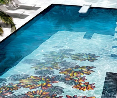
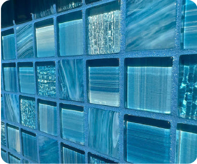
Stripes Mix Teak 10" x 10" Porcelain Tile

The Stripes Mix Teak tile brings energy and visual movement to any kitchen design. With its multi-directional lines and organic variation, this porcelain tile creates dynamic patterns that feel alive and expressive. Perfect for a backsplash or accent wall, it adds depth and rhythm without overwhelming the space. The interplay of warm and neutral tones makes it a versatile choice that pairs beautifully with both light and dark cabinetry.
This tile works best in kitchens where you want the tile to be a design statement. Use it behind open shelving or above a range to draw the eye and anchor the space with artistic flair. Because each tile’s pattern varies, installations feel unique and custom, giving your kitchen a one-of-a-kind look.
Sovana Mocha 18" x 18" Porcelain Tile

The Sovana Mocha tile leans into warm, wood-inspired neutrals that bring richness and comfort to a kitchen floor or backsplash. Its geometric, parquet-like pattern offers subtle texture without strong contrast, making it ideal for transitional and modern kitchen designs.
This tile’s mocha tones bridge the gap between bold and subtle, creating a warm foundation that pairs with white or dark cabinetry alike. It’s an excellent choice for kitchens where you want a cohesive, inviting feel that doesn’t compete with other design elements.
Venatto Matte Almond 10" x 60" Porcelain Tile

For a timeless and understated look, the Venatto Matte Almond tile delivers refined simplicity with its elongated format and nature-inspired tones. This porcelain tile works well on both floors and walls, offering design flexibility and a serene backdrop that enhances other materials in the kitchen.
The muted almond color brings a warm neutral palette that pairs with wood, stone, and painted cabinetry. Its larger size creates fewer grout lines, which helps visually expand the space and maintain a clean, cohesive aesthetic.
Understanding Color Basics for Kitchen Tile
Before selecting specific tiles, let’s cover some color fundamentals:
Light Colors
Light shades like whites, creams, and pale neutrals reflect light and make a kitchen feel open and airy. These are great for smaller spaces or kitchens with limited natural light.
Neutral Tones
Beige, taupe, gray, and wood-inspired neutrals offer a versatile base that complements most cabinetry and countertop materials. They’re timeless and less likely to feel dated over time.
Bold and Dark Shades
Deep blues, greens, charcoals, or black tiles create contrast and drama. They work well when balanced with lighter elements, such as white cabinets or metallic accents.
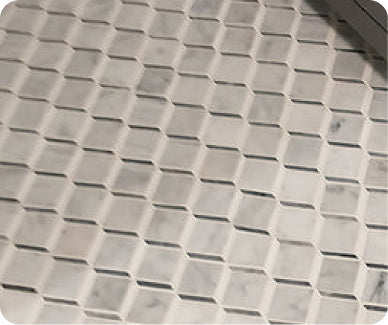
Textured and Patterned Tiles
Patterns add personality and movement. Whether subtle geometric lines or expressive motifs, patterned tiles can anchor a space without overpowering it.
How to Pick the Right Kitchen Tile Palette
Follow these steps to narrow down your choices:
Start With Your Fixed Elements
Look at what won’t change soon: cabinets, countertops, and appliances. Let these be your foundation. If you have white cabinets, you can explore stronger tile colors. If you have bold cabinetry, you might want subtler tile hues.
Consider Lighting
Natural and artificial lighting affects how tile color appears. Always view tile samples in your kitchen at different times of day to see how the light interacts with color.
Think About Scale and Tile Size
Large tiles with minimal grout lines make a kitchen feel more spacious. Smaller tiles or mosaics add texture and can be great for backsplashes. The size and format influence how the color is perceived.
Create a Mood Board
Use samples, photos, and swatches to build a mood board. Seeing how your kitchen tile colors play with cabinetry, countertops, and flooring helps you visualize the final result.
Balance Bold With Neutral
If you choose a bold tile color or pattern, balance it with neutral tones elsewhere to avoid visual overload. For example, a striking backsplash can be paired with softer floor tiles.
Tips for Mixing and Matching Kitchen Tile Colors
Once you’ve chosen your main tile color, consider how other tile elements will work with it:
Pair Backsplash and Floor Tiles Thoughtfully
Matching your backsplash tile exactly to your floor tile can create a seamless look, but contrast can also be powerful. A neutral floor tile paired with a bold backsplash draws attention upward and adds personality.
Coordinate With Grout
Grout color affects how tile color reads. Light grout with light tile emphasizes pattern and lines. Dark grout with lighter tile can define shape and add subtle contrast.
Use Accent Borders
Accent borders or trim tiles in complementary colors can frame your backsplash or floor area and tie in cabinetry or countertop hues.
Common Mistakes to Avoid
While trends are helpful, some choices can date quickly or clash with your overall design. For example, overly bright whites or pale neutrals may appear flat and show dirt more easily. Experts recommend richer, grounded hues that create depth and harmony with other materials.
Also, don’t choose tile color based only on images online. Lighting and surrounding colors can change how a kitchen tile looks in your own space. Always view samples in situ.
FAQ
How do I choose the best kitchen tile color for my space?
Start by evaluating your fixed elements like cabinets and countertops, then consider lighting and desired mood. Use samples in your space to see how colors change throughout the day.
Should kitchen tile color match my cabinets?
It does not have to match exactly. Complementary colors often create a more balanced and visually interesting design. Neutrals can anchor bold cabinetry, while contrast can make features pop.
What color grout should I use with kitchen tile?
Choose grout that either matches the tile for a seamless look or contrasts slightly to highlight patterns. For busy or textured tiles, matching grout often works best to avoid distraction.
Are lighter or darker kitchen tile colors better?
Both have their place. Light tiles open up space and reflect light. Dark tiles add drama and hide stains. Consider your kitchen size, lighting, and style when deciding.
Can kitchen tile color affect resale value?
Yes. Neutral, timeless palettes tend to appeal to a broader range of buyers, while bold, expressive tiles can add character but may not suit everyone’s taste.