




























































Beige Kitchen Tile Inspiration: Warm, Neutral Styles For A Soft Modern Look


A kitchen should feel welcoming, comfortable, and timeless. While bold colors and dramatic finishes can create memorable spaces, neutral tones continue to be one of the most reliable choices for homeowners who want a design that feels elegant for years to come. Warm beige tiles bring a sense of balance and calm, creating a foundation that works beautifully with a wide range of cabinetry, countertops, and decorative styles.
Unlike cooler neutrals that can sometimes feel stark, beige introduces warmth and softness. It creates an inviting atmosphere that feels connected to natural materials such as stone, sand, and wood. Whether used throughout an entire kitchen or as a subtle accent, this versatile shade can transform the room into a comfortable gathering space.
From classic layouts to contemporary designs, warm neutral surfaces offer countless possibilities. This guide explores different ways to incorporate beige tones into kitchen spaces, along with how different textures, patterns, and materials can enhance the overall look.
Stripes Mix Bamboo 10 X 10 Porcelain Tile

The Stripes Mix Bamboo 10 x 10 Porcelain Tile introduces a unique combination of warmth, texture, and contemporary pattern. Inspired by natural bamboo elements, this tile creates a visually interesting surface that brings organic character into kitchen environments.
Its striped design adds movement and dimension while maintaining a neutral color palette that feels versatile and refined. The pattern creates a sense of rhythm across the surface, making it an excellent choice for homeowners who want a decorative feature without relying on bold colors.
The 10 x 10 format provides flexibility for a variety of applications. It can be used as a kitchen backsplash to create a statement wall, installed throughout a smaller area for a cohesive look, or incorporated as an accent section to highlight specific architectural features.
The porcelain construction offers durability and easy maintenance, making it suitable for busy kitchen environments. Its strong surface performance allows it to maintain its appearance even in areas exposed to moisture, spills, and daily use.
The bamboo inspired pattern pairs beautifully with natural wood cabinetry, warm countertops, and minimalist décor. It also works well in contemporary spaces where organic textures are used to soften clean architectural lines.
Overall, this tile provides a balance between natural inspiration and modern design. Its subtle beige tones and linear pattern create a sophisticated surface that adds personality while maintaining a calm and inviting atmosphere.
Edna Travertino Bone MT 4 102B 1 X 1 Glass Tile

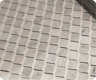
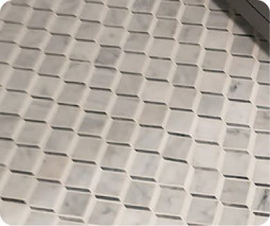
The Edna Travertino Bone MT 4 102B 1 x 1 Glass Tile offers a delicate blend of warmth and elegance through its soft travertine inspired appearance and glass construction. Designed to create subtle texture and light reflection, this tile brings a refined quality to kitchen spaces.
Its small format allows for intricate installation patterns that create visual detail without overwhelming the room. The compact design makes it especially effective for backsplashes, accent walls, and smaller feature areas where texture can become a focal point.
The bone inspired color creates a warm neutral foundation that complements many kitchen styles. It pairs beautifully with white cabinetry for a soft layered appearance or with darker finishes for a more dramatic contrast.
The glass surface reflects light throughout the space, helping kitchens feel brighter and more open. This quality makes it especially useful in areas where additional visual brightness is desired.
Its travertine inspired character introduces an organic feel, combining the beauty of natural stone with the sleek appearance of glass. The result is a surface that feels both luxurious and approachable.
This tile works well in transitional, contemporary, and classic kitchen designs. Whether used across an entire backsplash or as a decorative accent, it provides depth and sophistication while maintaining a warm and timeless aesthetic.
Perla Crema Chextile 17 X 17 Porcelain Tile

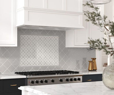
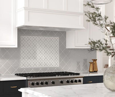
The Perla Crema Chextile 17 x 17 Porcelain Tile combines geometric elegance with warm neutral tones to create a sophisticated kitchen surface. Its larger format and decorative pattern make it an excellent option for homeowners seeking a design element that feels artistic while remaining versatile.
The structured motif introduces visual movement and creates a sense of craftsmanship. Instead of relying on strong colors, the tile uses shape and arrangement to add personality, making it suitable for kitchens that favor subtle sophistication.
The cream and beige inspired palette allows it to blend seamlessly with a variety of materials. It complements natural wood cabinets, white countertops, brushed metals, and earthy décor elements.
Its porcelain construction provides excellent durability and resistance to moisture, making it suitable for demanding kitchen environments. The larger format also reduces the number of grout lines, creating a cleaner overall appearance.
This tile can serve as a standout backsplash, a decorative flooring option, or an accent feature within a larger kitchen design. Its versatility allows it to support both traditional and modern interiors.
The Perla Crema Chextile creates a balance between pattern and simplicity. It adds visual interest without overpowering the surrounding space, making it a strong choice for kitchens that prioritize warmth, elegance, and timeless design.
Why Warm Neutral Tones Work So Well In Kitchens
The kitchen is one of the most frequently used areas of a home, which makes long term design choices especially important. Neutral colors are popular because they provide flexibility as styles, furniture, and décor preferences change over time.
Beige works particularly well because it adds warmth without becoming overpowering. It creates a softer alternative to bright white while still maintaining a clean and open appearance.
This color family also connects naturally with organic materials. Wood cabinets, stone countertops, woven textures, and greenery all pair beautifully with beige because they share similar earthy qualities.
Another advantage is how adaptable these tones are across different design styles. A traditional kitchen may use beige surfaces to create a classic, comfortable atmosphere, while a modern kitchen can use them to soften sleek lines and minimalist finishes.
Choosing The Right Shade Of Beige
Not all beige tones create the same effect. Small differences in undertone can significantly influence the overall feeling of a kitchen.
Warm beige shades often contain hints of cream, tan, or gold. These tones create a cozy atmosphere and work well with wood cabinetry and natural materials.
Cooler beige shades may include subtle gray influences, creating a more contemporary appearance. These are often paired with modern fixtures and streamlined designs.
Lighter beige surfaces can help smaller kitchens feel more open by reflecting natural and artificial light. Deeper beige tones add richness and create a more dramatic foundation.
Before selecting a final material, it is important to consider surrounding elements such as cabinet color, countertop pattern, and lighting conditions.
Popular Ways To Use Beige Surfaces In Kitchen Design
One of the most common applications is behind the countertop. This area provides an opportunity to add texture and personality while maintaining a cohesive color palette.
A neutral backsplash can create a calm backdrop that allows cabinetry and fixtures to stand out. Alternatively, a patterned design can introduce subtle character while still keeping the overall look refined.
Flooring is another effective application. Beige surfaces help create continuity throughout the kitchen, especially in open concept homes where the kitchen connects with dining and living areas.
Accent areas such as islands, coffee stations, or decorative walls can also benefit from warm neutral tones. These smaller applications allow homeowners to experiment with texture and pattern without overwhelming the room.
Combining Beige With Other Materials
One of the greatest strengths of beige is its ability to complement many materials.
Natural wood cabinetry is one of the most popular pairings. The combination creates a warm, organic appearance that feels both modern and timeless.
White cabinets paired with beige surfaces create a soft contrast that feels brighter than darker combinations. This approach works especially well in kitchens that prioritize an airy atmosphere.
Black fixtures and hardware add definition. The contrast between warm neutral surfaces and dark accents creates a sophisticated appearance without feeling harsh.
Stone countertops with natural veining also work beautifully because the subtle movement enhances the organic quality of beige tones.
Adding Texture For More Visual Interest
A neutral palette does not have to feel plain. Texture is one of the most effective ways to add depth.
Matte finishes create a soft, natural appearance and help reduce reflections. They are especially popular in modern kitchens where a calm aesthetic is desired.
Glass surfaces introduce light reflection and subtle movement, making them useful in kitchens that need additional brightness.
Patterned designs create another layer of interest. Geometric layouts, decorative motifs, and linear arrangements can transform a simple neutral color into a memorable design feature.
The key is using texture intentionally so that it enhances rather than competes with other elements.
Creating A Timeless Kitchen With Neutral Design
A successful kitchen design is one that feels beautiful today and continues to feel relevant years later. Warm neutral surfaces provide the flexibility needed to achieve that balance.
By combining thoughtful material choices with complementary colors and textures, homeowners can create kitchens that feel inviting and personalized.
The best designs are not necessarily the loudest. Often, the most memorable spaces are those where every element works together naturally.
Frequently Asked Questions
Are beige tones outdated in kitchen design?
No. Warm neutrals remain popular because they create timeless spaces and pair well with many materials.
What cabinet colors work best with beige surfaces?
White, wood, cream, gray, and darker contrasting cabinets can all complement warm neutral designs.
Can beige surfaces make a kitchen feel larger?
Yes. Lighter tones can reflect light and create a more open feeling, especially in smaller kitchens.
Are patterned neutral tiles too busy?
Not necessarily. Patterns in soft colors can add personality while maintaining a calm appearance.
What materials pair well with warm neutral designs?
Wood, stone, glass, metal accents, and natural textures all work beautifully with beige tones.
